Samsung Food: Casual Meal Planner
As Lead Product Designer at Samsung Food, I led the casual meal planner workstream, a simpler, to-do list way of planning taken from a premium concept test through twelve iterations and two research rounds to a list view released between March and May 2024, to bring the casual majority into the planner and build a planning habit.
Outcome
The planner, which had served a minority of detailed planners, became one of the app’s core wellness surfaces. Engagement and time in app rose after release, though the figures are not public. The Tailored Plan later prepopulated the planner, and the week’s nutrition was designed to read back from it into the health dashboard. The list view went live in March 2024, and tailored meals from the add flow, reordering, tooltips for checking and swiping a meal, and the first-use animations followed in releases through May.
Context
Samsung Food had a capable meal planner with low adoption. By the end of 2023 it was a calendar view built for detailed planners, with manual scheduling, day by day, from an empty state. Casual planners, the majority of the base, dropped back to discovery. About one in eight active users planned at all, and those planners were the stickiest and most engaged cohort in the app.
The brief was to simplify the overall experience and create positive habit loops for casual planners, with a to-do list approach to planning, where they add meals to a queue and mark each one made once it is cooked. The product was moving from a recipe app towards wellness, with a closer tie to Samsung Health and to AI, and the Premium tier needed a validated proposition. Both roadmap goals needed people planning, so we did the work in the planner.
Finding a Premium proposition users would pay for
We started with Premium, which needed a proposition users would pay for. We showed users thirteen concepts as clickable prototypes, one per idea: an ad-free experience, several kinds of ingredient substitution, a health profile, planning by meal type, a daily calorie and macro view, health recipe recommendations and food journaling. After the sessions the PO and I scored each concept on four axes: what users liked most, what they said they would pay for, the effort to build, and fit with the roadmap.
Smart substitutes and health recipe recommendations came out ahead on every axis, and both fitted the strategy. Substitutes went on to be released as ingredient substitutions in June 2023. Health recipe recommendations became the tailored plan, a week of meals users could add to their own plan. Its reach depended on the planner, which few people used, so in December 2023 we started the casual planner workstream to bring more users into it.
Concept, smart substitutes. Swap a recipe’s ingredients by goal: vegan, healthier, gluten free. One of thirteen prototypes in the Premium round.
Open in Figma ↗Play the prototype ↗ Get password →Concept, health recipe recommendations. A weekly plan generated from the health profile, with add all to planner. It became the tailored plan in Health v1.
Open in Figma ↗Play the prototype ↗ Get password →01Round one
Turning planning into a to-do list for casual planners
The calendar was built for scheduling a week day by day, the way detailed planners worked. Round one started from a design jam in December, where the question on the board was how the planner could support simple or casual planning. We took the direction from the framing beside it, planning as commitment on the principle of commitment and behavioural consistency, so that adding a meal would act as a small commitment users then keep. The reference was Fitness+ Plan, with its image-led card, large start button and the ability to swap.
We introduced a meal queue. Users would be assigned a simple or detailed view at onboarding, so casual planners would get the simple view and detailed planners would keep the calendar. The simple view showed tailored meals at the top, the entry point the recommendations needed, and a list of upcoming meals beneath, each with a check to mark it made. We drew three variants of the tailored meals module, each with its own set of add journeys from four: tap, drag and drop, quick view, and adding from the tailored plan page. There was also a request to check every screen with ads in place, since the free tier carries them.
Giving reviewers a brief for each iteration
I brought in this format to replace a fragmented workflow, and every designer on the team adopted it. Each iteration is one Figma page and opens with its own brief, an overview of the objective, what changed since the last iteration, what feedback is wanted, and what is out of scope. The triad reviewed each one, and design reviews with the wider team ran on the same iterations. We went from the jam to dev ready in twelve iterations, and four more followed, one per release.
Iteration 0, design jam. Three options for casual planning, the note on planning as commitment, a colleague’s sketch, and four meal card options for Premium and Basic users.
Open in Figma ↗ Get password →Iteration 1, tailored meals. The three variants of recommended meals above the queue sit on the left, each linked to its add journeys, with the ads check underneath.
Open in Figma ↗ Get password →Iteration 3, simple and detailed. Navigation changes and the detailed view, kept for planners, were both out of scope for this release.
Open in Figma ↗ Get password →Testing whether the queue read as a plan
We did not yet know whether casual planners would read a queue as a plan, or add the meals recommended to them. We ran research with the team’s researcher across the full design process, to inform the direction and then to validate it.
InformWhere POs disagree or are undecided on direction, we run research to give them evidence to decide on.
ValidateOnce direction is agreed, we test the solution with users to check it holds up.
We took round one to users to inform the direction. The moderated sessions on the queue concept covered comprehension of the tailored meals module, intent to add from it, and whether the queue read as a plan. I built the concept boards and the prototype used in the sessions.
Concept prototype. The queue once meals are added, with tailored meals at the top, the list beneath and a check per meal.
Concept boards ↗Play the prototype ↗ Get password →Releasing a single list view first
The sessions and the design review both showed that the queue had too much scope for a first release. Users responded to the check and to meals selected for them. A week selector, heavy cards, and a recommendations block competing with their own meals at the top of the screen distracted users in testing.
Across iterations five and six we drew six models and agreed on the simplest, a single list view with no week selector, lighter cards, and recommendations moved out of the top of the screen and into the add flow.
We split adding items into its own brief so the list view could go ahead lean. We would use data from the release to learn how often users switched views and where recommendations should go next.
We still designed every add journey, for recipes, food, notes and the tailored plan, as a separate stream with its own reviews.
02Round two
Putting the casual planner’s week in one list
The list had to work for one persona, the casual planner, and stay consistent with the calendar for users who switched between the two. In round two we worked out the logic under the list: what the drop-down does, what a card shows (ingredients, then cooking time, and the date once scheduled), how last week, this week and next week are labelled, and how list view and classic view, the calendar, share data, so that switching never loses a scheduled date.
To get answers tied to specific screens, we gave the iteration seven review a structured ask: things you like and do not want removed, questions asked on the board, things you would improve, in that order. Each question sat beside the screen it concerned: unscheduled at the top or the bottom, where today’s items go, whether notes follow the same logic as meals, and how the empty state reads. In iterations eight and nine we added every journey and card state, and dark mode.
Iteration 7, design review. The structured ask sits at the top of the board, and the persona card and the natural language labels are in this iteration too.
Open in Figma ↗ Get password →Iteration 8, all journeys. Onboarding, add note, check and done, delete, card states, and the first pass at dark mode along the bottom.
Open in Figma ↗ Get password →Validating the list view with users
With direction agreed, we needed to know that users could complete the list’s core tasks. We took round two back to users to validate it, with eleven tasks on one prototype: switch views empty and full, add recipes, add food, add a note, open a note, drag and drop, check and done, rate, re-add, delete. I built the task boards and the prototype and supported the researcher on the tasks.
Usability prototype. Task eight, check and done. Checking a card shows a meal done toast and moves the card under show done.
Task boards ↗Play the prototype ↗ Get password →03Handoff
Releasing a lean list view, then extending it
To keep the first release lean, we reduced the scope of iteration ten on the triad call before it went to dev review: notes simplified, ratings and made it removed, drag and drop removed to save backend effort, and a simple delete added. In iteration eleven we made the amends from tech review on 6 March 2024: a 50 meal limit with a swipe to make room, clearer labels on the clear actions, done meals collapsed at launch, and a show more after fifteen. That version went live.
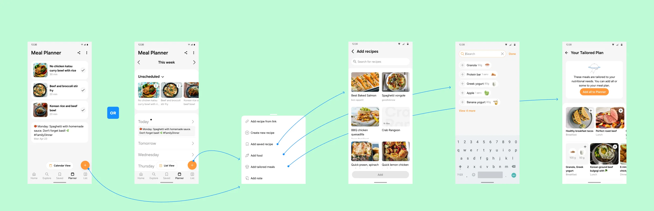
In the first follow-on release, in April, users could add tailored meals from the list view, through the add flow the recommendations had moved into. Tailored meals draw on the health profile, so users not yet onboarded in health met a consent gate first. In the same release we restored the rate flow when a recipe is checked. Reordering within unscheduled followed, then check and swipe and the first-use animations, which showed new and returning users how to check a meal and swipe it.
Iteration 11, dev ready. Every journey with its notes for engineering, the tech review amends included.
Open in Figma ↗ Get password →Iterative improvements, April. The check and rate journeys with notes on edge cases, and the add tailored meals journey with the consent gate for users who have not onboarded in health.
Open in Figma ↗ Get password →Check and swipe. One row for a new user and one for a returning one, with the timing between each screen for engineering.
Open in Figma ↗Play the empty plan ↗Play the full plan ↗ Get password →What was cut, and what was released
Round one
- Meal queue with tailored meals on top
- Simple and detailed view assigned at onboarding
- Week selector in the simple view
- Drag and drop from queue to plan
- Ratings and made it in the first release
- Quick view on meal cards
Released
- List view beside calendar view, with a visible switch
- One list: unscheduled, today, tomorrow, the week
- Check to mark a meal done, done list collapsed
- Notes, deleted on check
- Tailored meals from the add flow, behind health consent
- Reorder, swipe to delete, 50 meal limit
The cut items front-loaded planning before there was a habit to support, so we released what supports the habit loop the brief asked for, a single add, a check and a return visit.
Shaping the wider planner around how users eat and plan
The rest of the planner had its own workstream, and the two informed each other. Its mission was that the planner and its recommendations should reflect the way users actually eat and plan. Its smaller briefs are written up in Planner Improvements. In a quick wins pass we gave the calendar view more vertical space and natural language labels. Later, a longer planner exploration became a project of its own, the Tailored Plan, with fourteen iterations from list versus calendar, through a prepopulated setup flow and a conversational setup, to two handovers. Notes went into the weekly and daily views. Personalised servings adapted a recipe’s servings to the user’s nutrition targets. With leftovers, a meal users had made could be planned again. Both were handed over and released after I left. New meal cards carried recipe and product combinations.
Planner exploration, iteration 0. Three directions for the list: infinite scroll, a list with a week switcher, and a week title with a dropdown or a pager.
Open in Figma ↗ Get password →Personalised servings. Servings tailored to the user’s nutrition targets and units from their preferences, applied on the recipe and in the planner.
Open in Figma ↗ Get password →Leftovers. Made it, how many portions are left, and where to plan them.
Open in Figma ↗ Get password →The premium test’s health recommendations needed people in a planner with low adoption. We put the habit loop in place by rebuilding the planner as a list for casual planners, around a single add, a check and a return visit. We split the add journeys into a stream of their own so the list view could go ahead lean.
Sources
- Premium concepts ↗Figma, thirteen prototypes
- Casual meal planner ↗Figma, twelve iterations and a page per release
- Concept test ↗Figma, the boards and the prototype, round one
- Usability test ↗Figma, the task boards and the prototype, round two
- PrototypesPremium concepts ↗Iteration 8 journeys ↗Journey animations ↗Check and swipe ↗
- Parallel planner workFigmaQuick wins ↗Planner exploration ↗Notes ↗Personalised servings ↗Leftovers ↗New meal cards ↗
Contact
Get in touch
Product design lead across research, design systems and handover, with coding agents in the loop. Contract, outside IR35, or a permanent lead role.
- Available
- Now
- Location
- London, remote or hybrid, UK and EU
- Right to work
- UK settled status, EU citizen
- RolesLead Product Designer, Principal Product Designer, Design Engineer
- Experience10+ years
- ScopeResearch, design systems, prototyping, handover, QA with agents
- LanguagesEnglish, Italian, Spanish
- Email[email protected]
- LinkedInlinkedin.com/in/dariocodipietro
Professional profile
Copy into your coding agentSkills
- Product design, end to end
- UX and interaction design
- Visual design and motion
- Prototyping in Figma and code
- Design systems at scale
- User research and testing
- A/B testing and analytics
- Strategy and discovery
- AI product design
- Design to code, with agents
- Accessibility, WCAG 2.2 AA
- Leadership and mentoring
Platforms
iOS, Android, responsive web, smart TV and connected devices
Sectors
- AI products
- B2B SaaS
- Consumer apps
- Streaming, media and sport
- Health, wellness and food
- Legal tech
- Telecoms and utilities
Tools
- Figma
- FigJam
- Figma Make
- Claude Design
- Framer
- Axure RP
- Storybook
- Claude Code
- Cursor
- Codex
- MCP
- GitHub
- Linear
- Jira
- Confluence
- Notion
- Miro
- Prolific
- Lyssna
- Maze
- PostHog
- Amplitude