Samsung Food: Health Dashboard
As Lead Product Designer at Samsung Food, I designed the app's first health dashboard, released on the profile with progress against users' own nutrition goals, and then its trends, to move Samsung Food from a recipe tool towards the wellness side of the Samsung ecosystem.
Outcome
The daily nutrition goals sheet and the progress chart became design system components other squads built with. By IFA 2024 Samsung was describing Samsung Food+ as “integrating a health profile and goals, providing personalized meal plans with recipe recommendations”, and the meal planner page still promotes weekly progress as a way to build healthier habits. Progress against those goals went live on the profile, built only from the goals users set and the meals they tracked.
Context
Engagement in Samsung Food stopped at recipe discovery and meal planning, with no retention loop beyond them. Food tracking, a workstream I led alongside planning, was about to go live.
The brief was to bring Samsung wearable data together with our food database and use tracking to keep users in a healthy habit loop. In the first note on the board, the PO asked for the dashboard to reflect the nutrition of what people cook and eat, and to mark the steps they take towards their goals.
Turning the brief into experiences for a healthy habit loop
In a brainstorm with the director of design on 15 April, we mapped each objective in the brief to experiences, then to ideas. We left open how the “made it” flows on the roadmap would record intake, and where the dashboard would sit in the IA, on the profile, on Home or in a new Kitchen tab.
Apple Fitness was the reference for structure. A reviewer suggested counting the food a user saves after an expiry reminder, the way SmartThings Energy counts CO2, for a zero-waste story.
Iteration 0. The first profile dashboards sit top left, drawn before any mapping.
Open in Figma ↗ Get password →01Discovery
Surfacing tracking insights across the app
In iteration 1 I turned the brief into modules fed by tracking data, such as a tracking helper, post-workout ideas, streaks and celebrations. Each could run up to four variants by context and sit on Home, Explore, the meal plan or a new Insights panel on the profile.
Each iteration was one Figma page, reviewed with the PO and dev, and pages marked DR went to the wider team. Iteration 1 was the first DR, and on it I asked for feedback on the team’s appetite for each idea, which ideas to concept test, and a direction.
Iteration 1, design review. A question for reviewers beside each block.
Open in Figma ↗ Get password →Giving users one place to check their nutrition
Over iterations 2 to 7 I narrowed the modules to one screen, an Insights tab on the profile with three blocks: performance at a glance, progress against macro goals, and trends. The chart block had three variants, one of them a single macro at a time.
I took four performance concepts to the review before testing. Three nudged users to stay in a green sweet spot, reading under or over as under- or overeating, as a bar, an arc and a traffic light ring. The fourth showed how closely intake matched the goals, from imbalanced to ace.
Iteration 7, blocks 2 and 3. Weekly progress against the goal, and trend tiles led by a health score.
Open in Figma ↗ Get password →Iteration 7, performance concepts. One concept per row, five states each.
Open in Figma ↗ Get password →Testing which concepts users understood and valued
InformWhere POs disagree or are undecided on direction, research gives them evidence to decide on.
ValidateOnce direction is agreed, research checks that the solution holds up with users.
The POs needed evidence to choose between the concepts. To inform that choice, the researcher ran the concept tests as moderated interviews with our own users, on prototypes I built. We agreed beforehand to learn whether users understood and valued the first two blocks, which variants to take forward, and whether trends confused them next to Samsung Health data.
Concept prototype. The screen shown in interviews: the score with its verdict, meals tagged low fibre or high fat, and meals to raise the score.
Concept boards ↗Play the prototype ↗ Get password →Descoping to hard metrics
The tests showed that the POs disagreed about what the score should be based on. Nobody had settled which inputs the inferred metric used, which model produced it, or who owned that model.
Without an agreed model, we could not tell a user why they saw “You can do better”.
We agreed with the POs to descope. Phase one would show hard metrics only, calories and macros against the goals users set. The score, its verdicts and the recommendations tied to it were parked until a model was agreed.
02Nutrition progress
Showing progress against one daily goal at every timeframe
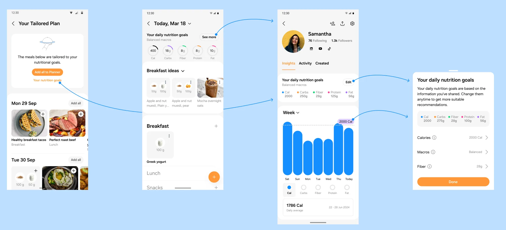
Nutrition progress was split out in Q3 and ran three sprints with its own PO and dev. It followed the goals feature, where users set daily nutrition goals, and those goals appeared in three places: the tailored plan, the planner and the profile. In sprint 1 I tied the goals to one sheet, opened from all three.
I kept the single-macro variant from the tests. In sprint 2 I replaced daily, weekly and monthly bars with the windows Apple Health uses: week, month, six months and year. Bars stay in daily units throughout, with a daily average as the summary, so one daily goal line works at every timeframe. A goal changed mid-week shows as a step in that line.
Sprint 3, the flow. The tailored plan with its goals link, the planner day with its goal rings and the Insights tab with its week chart, each joined to the goals sheet.
Open in Figma ↗ Get password →Sprint 2, timeframes. Under the four windows, a calorie goal raised to 2,000 on Thursday.
Open in Figma ↗ Get password →Checking users could read the chart and the goal line
With the direction agreed, we needed to check the chart with users before handover. The researcher ran moderated usability and comprehension sessions to validate the designs: reading the chart, understanding the goal line and knowing the next step. I helped build the tasks.
Handing over the chart as design system components
In sprint 3 I built the block from design system components and marked the handover ready for dev. The component is fixed at 274pt, with the goal tag pinned to the top unless a bar far exceeds the goal and the range rescales. Rising, falling and overlapping goals each had an example, as did the empty, partial, loading and no-consent states. In the no-consent state, “Start now” leads into the tailored plan’s goal set-up.
The handover also covered a feature flag, with a Beta tag and a feedback button. Calories are free, and for free users the other macros show a Samsung Food+ prompt in place of the chart.
Sprint 3, sizing. The rules as annotated for dev.
Open in Figma ↗ Get password →Sprint 3, flags. Dashboard off, the beta chart, the Samsung Food+ prompt, and no goals set.
Open in Figma ↗ Get password →03Trends
Showing how users’ nutrition changed week to week
Trends was split out next and ran six sprints with both POs, and did not reach users. The brief was nutrition and meal trends modelled on Apple Fitness, to sit under the progress chart, which was then in delivery.
At the first review I asked which trends to show and whether they needed their own block. Of six trend indicators, one coloured its arrows by whether a rise is good for that nutrient, so rising fat shows red. I flagged the colour-only one as unfriendly to colour-blind users.
At the second I asked whether moving the bars in delivery to rings was worth the effort, or whether to offer both behind a switch, as Gentle Streak does, at the risk of clashing with the timeframe selector. In sprint 3 I kept both, with rings for a weekly snapshot and bars for progress. I also added sugar, salt and saturated fat, which the app tracked for ingredients but showed only in recipe nutrition.
Sprint 2, bars or rings. In light and dark, above a goals grid with an AI-generated tip.
Open in Figma ↗ Get password →Estimating intake from planned meals
Only planned meals would be available to trends at first, so the chart read “estimated daily planned”, with an info sheet asking for at least two planned meals a day.
Later, users would see planned and tracked meals together and would need to tell them apart. I weighed three ways to show them. No distinction was the easiest to deliver and scan, but gave users no reason to track. Soft tones for planned meals were harder to read over the goal and harder to build. Tabs stayed clean but added an interaction. In sprint 5 I merged the charts and summary into one nutrition block.
Sprint 4, planned against tracked. Each variant under a card with ten planned and four tracked meals.
Open in Figma ↗ Get password →Proposing AI-generated nutrient tips
I generated the per-nutrient tips with AI, to show they could be produced in-app through an API, likely for Samsung Food+. Eight nutrients in four states came to 4,064 combinations for up to three nutrients off target, too many to write by hand, so I proposed about 50 written messages for the top two nutrients, or an AI API with review and caching.
After the last review, on 19 November, the director of design sketched food group trends, such as processed food and wholegrains, as a next step.
Sprint 5, messages. One, two and three nutrients off target, with the AI-generated tip behind each nutrient.
Open in Figma ↗ Get password →Iteration 0, first screen. A weekly calorie budget, macro counters and a Protein Master badge.
Open in Figma ↗ Get password →Released. Goals, the week chart, the macro selector and the daily average.
Open in Figma ↗ Get password →What was cut, and what was released
Discovery
- Nutrition score with a verdict
- Inferred tags on each meal
- Meals recommended to move the score
- Achievements, streaks, celebrations
- Modules on Home, Explore and the meal plan
- Trend tiles
Released
- Insights tab on the profile
- A goals sheet shared by three entry points
- Bars per macro against a daily goal
- Week, month, six months and year
- Empty, partial, loading and no-consent states
- Macros beyond calories in Samsung Food+
We cut what needed an inferred metric or sat outside the Insights tab.
The inferred score stayed parked, and through the trends work the recommendations depended on a Diet Score that was not yet available. The trends designs showed intake estimated from planned meals, with a label saying so on the chart. With no model agreed, users got goals, a chart per macro and a daily average.
Sources
- Health dashboard, discovery ↗Figma, iterations 0 to 8
- Health dashboard, concept testing ↗Figma, the boards and five prototypes
- Health dashboard, nutrition progress ↗Figma, sprints 1 to 3 and the handover
- Health dashboard, trends ↗Figma, sprints 1 to 6
- PrototypesConcept clickthrough ↗Switching through charts ↗
Contact
Get in touch
Product design lead across research, design systems and handover, with coding agents in the loop. Contract, outside IR35, or a permanent lead role.
- Available
- Now
- Location
- London, remote or hybrid, UK and EU
- Right to work
- UK settled status, EU citizen
- RolesLead Product Designer, Principal Product Designer, Design Engineer
- Experience10+ years
- ScopeResearch, design systems, prototyping, handover, QA with agents
- LanguagesEnglish, Italian, Spanish
- Email[email protected]
- LinkedInlinkedin.com/in/dariocodipietro
Professional profile
Copy into your coding agentSkills
- Product design, end to end
- UX and interaction design
- Visual design and motion
- Prototyping in Figma and code
- Design systems at scale
- User research and testing
- A/B testing and analytics
- Strategy and discovery
- AI product design
- Design to code, with agents
- Accessibility, WCAG 2.2 AA
- Leadership and mentoring
Platforms
iOS, Android, responsive web, smart TV and connected devices
Sectors
- AI products
- B2B SaaS
- Consumer apps
- Streaming, media and sport
- Health, wellness and food
- Legal tech
- Telecoms and utilities
Tools
- Figma
- FigJam
- Figma Make
- Claude Design
- Framer
- Axure RP
- Storybook
- Claude Code
- Cursor
- Codex
- MCP
- GitHub
- Linear
- Jira
- Confluence
- Notion
- Miro
- Prolific
- Lyssna
- Maze
- PostHog
- Amplitude