Samsung Food: Tailored Plan
As Lead Product Designer at Samsung Food, I led the planner from a manual, empty-state experience to the Tailored Plan, a generated weekly plan with setup, weekly review and regeneration, shopping list integration and a freemium gate, to bring casual users into planning and onto Samsung Food+.
Outcome
Almost every active user came to hold a tailored plan after release, against about one in eight who planned before, and many more planned regularly, though the figures are not public. Samsung Food now offers the plan as Tailored for You, with three days free and a full week on Samsung Food+, the split first drawn in Health v1 in 2023. The help centre describes the For You section as a redesigned version of the Tailored Plan. The plan built on the casual planner and the health dashboard. It is generated from onboarding and Samsung Health data, the shopping list and the leftovers come from it, and its nutrition was designed to read back into the dashboard. Both handovers went to engineering in the first quarter of 2025. When I left, setup and plan generation were in delivery, and a single field for adding meals and automatic notes were in design as the next brief.
Context
The original planner was a calendar view built for detailed planners, complex to use and unappealing to casual planners. The casual planner had since been released, adding a list view with a check per meal and tailored meals reachable from the add flow, but adoption of the recommendations still depended on intent. To reach a shopping list, a user took four manual steps from an empty and uninspiring entry point: open the planner, go to the tailored plan, add meals to their own plan, then add them from the plan to a shopping list. Each step was a drop-off point. Roughly one in eight active users planned and planners were the stickiest cohort, so the entry point was worth the investment.
Our hypothesis, set in a 1:1 with the PO in November, was to generate the plan, let users tweak it and build the shopping list from it, following the prepopulated pattern of Mealime, MealPrepPro and Innit. The plan would be opt-out, to draw on loss aversion. We framed the workstream with two how-might-we questions: how might we move people through planning faster to reach the next phase, and how might we get them to a populated plan and shopping list in a fraction of the time and effort.
Testing an easier plan view for casual planners
The generated week needed a container that casual planners would find simpler than the calendar, and we settled it over iterations 0 to 3. In iteration 0 we explored a prepopulated list and a prepopulated calendar in parallel, each reviewed with the PO, and in iteration 1 we added tailored plan variants and plan collections. In iteration 2 I mapped the current and future flows, with two ways to connect an opt-out plan to the shopping list: a short confirm-and-generate flow that verifies the pantry and removes unwanted items, or the plan’s contents surfaced inside the list to confirm before adding. In iteration 3 we fixed the two candidates as test variant A, the list, and test variant B, the calendar, and reviewed them with Growth. We tested both with users and kept the list, which let users add recipes to their plan in fewer steps and fine-tune it later when they wanted more control.
Iteration 2, the hypothesis. Current flow: empty plan, go to tailored plan, add to my plan, add to my shopping list. Future flow: generated plan, tweak or remove, with the shopping list already generated from it. The two ways to connect the shopping list sit below.
Open in Figma ↗ Get password →Iteration 3, variant A. The generated week as a list, reached from a review notification, with the shopping list updated as part of the flow.
Open in Figma ↗ Get password →Iteration 3, variant B. The same journey with the generated week in the calendar view, for the growth team.
Open in Figma ↗ Get password →01Setup
Getting users straight into a plan
Creating a meal plan took attention and focus, since users had to choose which recipes to add, on which day and for which meal. We introduced a setup that generates the plan with little effort, from preferences users had already given us and a few questions about days and frequency. We built it over iterations 4 to 6. First access opened from the empty planner or a home placeholder and asked which meals to plan for, with weekday dinners recommended as the start. It then showed meal preferences prepopulated from onboarding and Samsung Health data, a preview of the plan, ingredients at hand to seed the shopping list, and final toggles for a weekly plan, weekly shopping and reminders. Cancelling returns to the empty plan. Six questions became five once the design team agreed that a step split in two in the previz worked as one.
In a design jam with the second designer we added the date picker variants, the flavour profile (diet, avoidances, favourite cuisines, dislikes) and a question on how many times users want to cook per week. Of all the setup questions, cooks per week had the most effect on the plan, since fewer cooks mean fewer distinct meals and more leftovers planned. In iteration 6 we added plan states, plan review options and the generating state, an animation on the Recipe AI pattern, with a copy note that generation may take up to twenty seconds.
Iteration 4, first access. Seven steps with the reasoning noted above each, among them a preview before committing and ingredients prepopulated from the plan settings.
Open in Figma ↗ Get password →Iteration 5, flavour profile. Diet and avoidances reused from onboarding, with cuisines and dislikes still to design.
Open in Figma ↗ Get password →Iteration 6, setup. Cooks per week, start day, meals, preferences, ingredients at hand, final toggles, generating and the plan, with three variants of the leftover question along the bottom.
Open in Figma ↗ Get password →Testing setup and plan review with users
We took iterations 7 and 8 to the wider team as design reviews, with the open questions set beside the screens. We compared the stepped setup with a conversational setup generated with ChatGPT, a chat that asks the same questions in turn and ends in the same plan. For plan review we compared a stepped flow, as in setup, with a single page. We also explored the freemium gate here for the first time, with three entry points.
Plans were regenerated weekly from the start day users set in their preferences, and we used the review before each new plan as a hook to bring users back into the app. In iteration 9 we set out the review-day model, with Sunday as review day. The next plan is prepared as the current one ends, and users are told in the app and by email, with time to check it and adjust it to their own needs before it starts. In the same iteration we added the shopping integration.
InformWhere POs disagree or are undecided on direction, we run research to give them evidence to decide on.
ValidateOnce direction is agreed, we run research to check that the solution works for users.
We ran research alongside the reviews, on the same cadence as the casual planner, with moderated sessions on the list and calendar variants to inform the container decision, then on the setup flow and the plan review to validate them once direction was agreed. The research files are kept apart from the design files and are not reproduced here. We based the decisions below on their outcomes.
Iteration 8, design review. Stepped setup above and conversational setup below, with the full chat transcript beside it and a question to the team on which they preferred.
Open in Figma ↗ Get password →Iteration 8, plan review. The Sunday notification into a settings page, ingredients, regeneration and accept plan, with the choice between a stepped review and a single page set beside it.
Open in Figma ↗ Get password →Iteration 10, plan edit. The overflow menu on a generated week, plan settings, and regeneration from a changed setting, with email as the second channel for review day.
Open in Figma ↗ Get password →Simplifying setup and converting users to Plus
After the design reviews and the research sessions, we kept the stepped setup to reduce engineering cost and speed up delivery. The conversational setup demonstrated well, but it cost more to build, review and localise for the same inputs. For plan review we chose the single page over the stepped flow, since a returning user changes one setting and does not need to answer five questions again. For the freemium gate we took three variants to handover, so the PO could pick one against the subscription data.
The plan is generated from settings users have already given us, so setup asks mainly for the start day, meals to plan and cooking days, which onboarding does not ask for. Preferences are prefilled from onboarding and Samsung Health, and everything stays editable.
The freemium gate applies to generated plans only. Three free tailored plans, then the Plus trial. The list view and the calendar stay free, so no user loses a feature they had.
02Around the plan
Integrating shopping, leftovers and nutrition into the plan
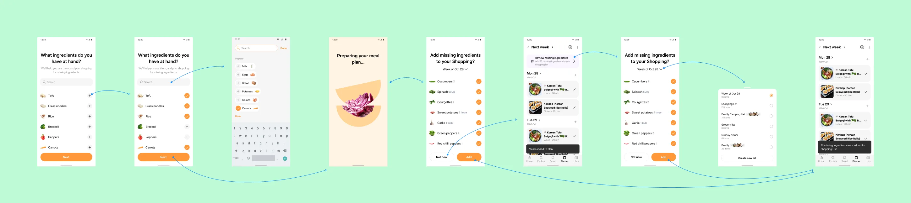
In user research, people told us they wanted shopping lists built from the meals in their plan, without adding them by hand, so they could shop for what they had actually planned. In iterations 10 and 11 we connected the rest of the planner to the generated plan. Shopping list integration came in two variants, missing ingredients added at generation or a review missing ingredients banner on the plan, and both lead to the same week-of picker in Lists. Each list is named after its week by default, and users can rename it. Leftovers went into the made it step, with portions scheduled automatically for the next day’s lunch and a manual override, and repeated meals marked as leftovers so users can see the effect of their cooking days setting. Meal history came in two variants. Calories per day and the macro split went into the plan header and onto each day, from the same data the health dashboard reads. Notes, a daily view, date variants and header variants made up the rest of iteration 11.
Iteration 11, shopping list integration. Both entry points through to Lists, with a note on the right on how a long list name truncates.
Open in Figma ↗ Get password →Iteration 11, nutrition in the plan. The generated week in list view, with the carbs, protein and fat split in the header and above each day.
Open in Figma ↗ Get password →Iteration 12, swap. Users swap a meal from saved recipes, leftovers, previously planned meals or swap ideas, through the existing add journeys, as marked on the board.
Open in Figma ↗ Get password →03Handoff
Splitting the work into two handovers
Over iterations 0 to 12 we took the work from the hypothesis to handover, and I split the handover in two so engineering read one page per release. Handover one, from iteration 10, held setup and the three freemium variants: three free plans with a counter, limited meals per plan, and straight to the paywall. Handover two, from iteration 12, held the shopping list integration, the food list integration and swap. Each handover page holds the journeys only, with the review pages kept separate.
Handover one, setup. Every step of the stepped setup with its sheets, from entry point to generated week, with plan review day asked as a step of its own.
Open in Figma ↗ Get password →Freemium, three free plans. A counter at generation, then the Plus trial. Of the three variants it keeps the plan visible longest, and the counter shows the limit from the first plan.
Open in Figma ↗ Get password →Freemium, to paywall. The shortest path to Plus, where setup ends at the paywall and no free plan is ever shown.
Open in Figma ↗ Get password →What was cut, and what was handed over
Explored
- Prepopulated calendar view as the container
- Conversational setup
- Stepped review on return
- Meal history
- Limited meals per plan and straight to paywall, handed over as alternatives
- Pantry confirmation before generating the list
Handed over
- Stepped setup, prepopulated from onboarding
- Generated week in list view, accept or clear
- Plan review day, in app and by email
- Single page review, settings and regeneration
- Shopping list integration from missing ingredients
- Swap from saved, leftovers and previously planned
- Three free plans, then the Plus trial
We cut the options that asked users for more input than the plan needed, or engineering for more work than the first release needed, and handed over the journeys users need to accept a generated plan, keep it and shop from it.
Expanding add to plan based on user data
Users could only add their own saved recipes and foods to a plan, so many created a new recipe from inside the planner instead, which made little sense mid-planning. In iterations 12 and 13 we looked at what users typed. The PO had captured the text of those new recipes, and I ran the set through ChatGPT for themes: 41% were referencing dish names, 22% adding food items or ingredients, 18% quick-saving online recipes, 12% managing leftovers and meal prep, and 7% creating a full recipe. I ran the same analysis on user notes and found the same pattern independently: 42% meal names and basic descriptions, 20% leftover and snack planning, 14% placeholder entries.
From that I proposed replacing the add menu with a single text field, so users could add what they actually type, mostly dish names and foods, in one step. If the query contains a meal with an exact match in the database, the field returns it, and if it contains a meal with no match, the field generates one. Beneath the match it surfaces leftovers, saved recipes, collections, communities and creators the user follows. The field imports the recipe from a pasted URL and turns anything else into a note. When confidence is high the field adds the match without a prompt, and when it is low it asks first. Auto notes follow the same rule, and when a note names meals the planner offers to add them and asks whether to keep the text.
Iteration 13, the analysis. The new recipe and user notes analyses with their percentages, the reasoning, and the rule for typed input on the right.
Open in Figma ↗ Get password →Iteration 13, adding meals. Grilled salmon matched from the food list and leftovers, grilled salmon with rice as a generated match, and the sources a match can come from, with the confidence threshold for prompting noted on the right.
Open in Figma ↗ Get password →We spent fourteen iterations on one surface, and most of that time on shopping, leftovers, nutrition and notes, the features around the plan. Each of those had been a separate workstream before this one, and here we connected all of them to the generated plan. In retrospect I would have released a simpler generated plan earlier, behind a feature flag, and used real usage to decide which of those features came next.
Sources
- Planner exploration ↗Figma, iterations 0 to 13 and the two handovers
Contact
Get in touch
Product design lead across research, design systems and handover, with coding agents in the loop. Contract, outside IR35, or a permanent lead role.
- Available
- Now
- Location
- London, remote or hybrid, UK and EU
- Right to work
- UK settled status, EU citizen
- RolesLead Product Designer, Principal Product Designer, Design Engineer
- Experience10+ years
- ScopeResearch, design systems, prototyping, handover, QA with agents
- LanguagesEnglish, Italian, Spanish
- Email[email protected]
- LinkedInlinkedin.com/in/dariocodipietro
Professional profile
Copy into your coding agentSkills
- Product design, end to end
- UX and interaction design
- Visual design and motion
- Prototyping in Figma and code
- Design systems at scale
- User research and testing
- A/B testing and analytics
- Strategy and discovery
- AI product design
- Design to code, with agents
- Accessibility, WCAG 2.2 AA
- Leadership and mentoring
Platforms
iOS, Android, responsive web, smart TV and connected devices
Sectors
- AI products
- B2B SaaS
- Consumer apps
- Streaming, media and sport
- Health, wellness and food
- Legal tech
- Telecoms and utilities
Tools
- Figma
- FigJam
- Figma Make
- Claude Design
- Framer
- Axure RP
- Storybook
- Claude Code
- Cursor
- Codex
- MCP
- GitHub
- Linear
- Jira
- Confluence
- Notion
- Miro
- Prolific
- Lyssna
- Maze
- PostHog
- Amplitude