Samsung Food: Health Goals
As Lead Product Designer at Samsung Food, I designed the app's first health features so meal planning could work to each user's nutrition targets, with a health profile that sets them, meal recommendations and a planner built around them, and the tailored plan offered in Samsung Food+.
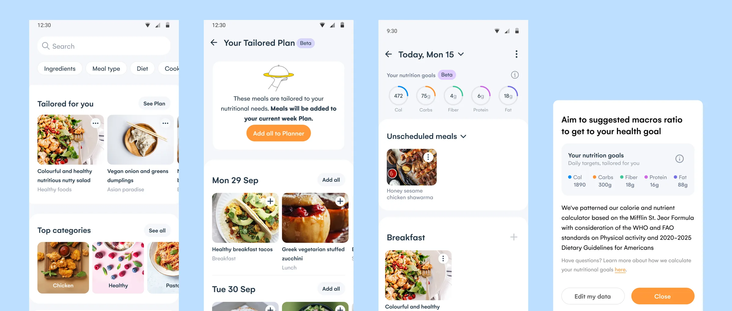
Outcome
The meal cards and the nutrition rings in the daily planner became design system components other squads built with. At IFA 2024 Samsung announced the freemium split drawn here for the tailored plan, three days free and the full week on Samsung Food+. The tailored plan page, the daily planner with its rings, the planner’s meal type rows and the cards for single foods were all still in the released flow in 2024, as the health dashboard study shows. The dashboard added weekly progress to that flow. Samsung Food launched in 104 countries on 30 August 2023, and Samsung’s announcement described “individualized daily meal plans” built from user data and dietary preferences.
Context
Early in 2023 the Samsung Food planner was a weekly list of recipes. It had no meal types or daily view, and it took recipes only, so a single food such as an apple could not be planned.
For users to plan against nutrition targets, we had to collect health data the app did not hold, which required their consent. The tailored plan was to go to Beta users first and then become a feature of Samsung Food+, the Premium tier. Every screen had to work on every tier, for users with and without consent.
Setting nutrition targets from a health profile
To calculate the targets that the recommendations and the planner would work to, we first needed each user’s health data. We introduced a health profile of five questions, sex, year of birth, height, weight and activity level, and offered it in an in-app message in exchange for tailored recipes and insights. Users could skip every step, and the first skip showed a warning that recommendations may not be accurate. Users who had skipped diet and avoidances in the sign-up onboarding were asked for them again.
Health profile onboarding. The offer, three of the five questions and the success screen. Height takes centimetres or feet and inches.
Open in Figma ↗Play the prototype ↗ Get password →The answers set daily targets for calories, carbs, fibre, protein and fat. An info sheet named the basis of the targets, the Mifflin-St Jeor formula with the WHO and FAO standards on physical activity and the 2020 to 2025 Dietary Guidelines for Americans. It linked to the health data in settings so users could change it. The profile showed the same daily targets.
Asking for consent before collecting health data
Health data needed consent before any question. I drew three versions of the consent step. The first put the terms and privacy line above the start button, the second a consent screen with separate toggles for health data, terms and marketing, and the third a single toggle for health data. In the June delivery, users who did not consent saw none of the health features.
Consent options, from the sandbox. Continue stays disabled until the mandatory toggles are on, and the marketing toggle is optional.
Open in Figma ↗ Get password →01Planner
Giving every planned meal a day and a meal type
To track a day against its targets, every planned meal needed a day and a meal type. Our first deliverable was a redesign of the native planner around them, reviewed with the developers in the first quarter of 2023.
Every meal took a meal type, breakfast, lunch, snacks or dinner, and meals already in a plan defaulted to dinner. A daily view opened from each day of the weekly list, with a slot per meal type. Dropping a meal into a slot raised a snackbar naming the meal type, with a Change action, and each card’s menu offered Change day and Change meal type.
Dev review, daily view. Four journeys on one page, with the add from FAB journey built from screens in the mobile master file.
Open in Figma ↗ Get password →A row at the top of both views held unscheduled meals, and a dropdown switched it to the user’s recipes or to previously planned meals, each capped at 50. Every add, move, remove and clear had its snackbar, and the weekly view warned when a day was full. The planner had taken recipes only, and the new cards took recipes, single foods with their quantity, combined foods and a dish with a food. They were built as components with a variant per type and size.
New meal plan cards. Android on the top row and iOS and web below, with long labels cut at two lines.
Open in Figma ↗ Get password →In the same redesign we specified notes, one per day, with a prompt before replacing a note already on that day. Notes were visible to everyone on a shared plan, so people planning together could leave each other notes for the day. I drew the same daily view, notes and top row for the web app. When a colleague found the FAB add journeys inconsistent in the documentation, I redrew them, adding the journey from the daily view, which had never been documented.
02Recommendations
Recommending meals that meet users’ nutrition goals
With targets set, users still had to find meals that met them, so we put recommendations where users already browsed and planned. In Explore, a Tailored for you row showed up to twelve recipes and ended on a card to the tailored plan. In the planner, rows of breakfast, lunch, snack and dinner ideas stayed the same from week to week, and their eighth card opened the tailored plan.
The tailored plan listed a week of meals by day. Users could take as much of the plan as they wanted, adding the whole week, a day or a single meal to their own plan and removing them again from the same page. Meals added from Monday to Friday went into the current week and meals added at the weekend into the next week, so a plan added at the weekend did not fill days already past. Each week started on the day set in the planner settings.
June 2023 delivery, tailored plan. Each add is confirmed by a snackbar with a link to the planner.
Open in Figma ↗ Get password →For Explore in Beta, I specified two variants of the Tailored for you row for an A/B test, a carousel of recipes and a banner that opens the plan, to learn which entry point brought more users into the tailored plan.
Explore, variant A. The Tailored for you row as a carousel.
Open in Figma ↗ Get password →Explore, variant B. A banner with See Plan in place of the row.
Open in Figma ↗ Get password →Releasing to a small Beta before Samsung Food+
What each user saw depended on whether they had consented to share health data and on how far the release had gone. I mapped the release in two iterations of the journeys, defining what every user saw at each stage. Both covered the same five phases: nothing released, a partial feature for everyone, the full feature in Beta, the full feature hidden, and the full feature in Premium. In the first I split every phase between users who consented and users who did not. In the second I assumed consent to keep the map simple, and users who did not consent got one journey in the June delivery, with no feature at all.
Each journey was labelled with one of four experiences: no feature, a partial feature, a Premium upsell or the full feature. Beta users also saw Beta tags and feedback reminders. The partial feature was meant to raise engagement among users outside Beta. The upsell let users upgrade to the full experience from an in-app call to action. Beta went by invitation to under 1 percent of users, hundreds up to a thousand, who had to accept it. Those who did got the full feature, with a way to give feedback, before it was offered in Samsung Food+.
June 2023 delivery, phasing. The legend of four experiences at the top, and each release stage below for users who consented.
Open in Figma ↗ Get password →Splitting the feature across free users and Samsung Food+
After the feature left Beta and before the tailored plan was in Samsung Food+, every user still had to see something. In a design jam we worked through five options for that period: a partial tailored plan, eight recommendations with no plan, the new planner rows alone, nothing at all, and a waitlist.
Design jam. The options for all users on the left, and on the right the upsell page once the tailored plan is in Premium.
Open in Figma ↗ Get password →In the August 2023 Freemium journeys, free users kept the recommendations, twelve in Explore and three per meal type in the planner, and the tailored plan became the offer for Samsung Food+.
They saw three days of the plan with a free trial at the top and the foot of the page, and Beta and Samsung Food+ users got the full week.
From the three days, free users saw what a tailored week held, and they could start a Samsung Food+ free trial from the plan.
Freemium, top of the tailored plan. Weekly personalised plans, generated from the user’s preferences, with a free trial.
Open in Figma ↗ Get password →Freemium, foot of the plan. After three days, Want more? and the same free trial.
Open in Figma ↗ Get password →03Nutrition
Showing progress against daily targets as meals are planned
After the redesign each day had meal types, but the planner had no way yet to show how a day’s meals compared with the user’s targets. Nutrition in the meal planner moved into a file of its own at iteration 9, with its own PM, and went into delivery in the third quarter of 2023.
The daily view opened on the user’s nutrition goals, five rings for calories, carbs, fibre, protein and fat. The rings filled as meals were planned, so users could track their goals by adding food to the planner. The rings were one component with empty, partial and full states. They animated with a sine ease-out of about 250 ms, and I simulated it in the prototype because Figma could not easily draw a radial animation. At first access after the release, a full-screen message told users they could now track their goals in the planner, and an in-app message prompted users with an empty planner to start planning.
August 2023 delivery, Beta. Each journey has its own background, with the tier’s feature flags at the top left and the animation prototype on the right.
Open in Figma ↗Play the prototype ↗ Get password →For the rings to count single foods as well as recipes, adding a food from search had to be quick. In iteration 10 I drew two variants of the add food journey, variant A listing recent foods with their quantities and variant B showing them as chips.
Add food, variant A. Recent foods such as 50g granola, results for apple, and the apple added to breakfast.
Open in Figma ↗ Get password →Add food, variant B. Chips with a plus, then the snackbar and the updated rings on the day.
Open in Figma ↗ Get password →To keep each day’s nutrition balanced, I drew alerts for over-planning: a snackbar for a day planned past 100 percent of its calorie target and a modal above 120 percent. The rules for when each alert would return were agreed before the whole journey was scrapped.
Over-planning, scrapped. The modal suggested swapping a meal for an alternative to keep nutrition balanced.
Open in Figma ↗ Get password →The macro labels were abbreviated to fit every language tested, and the abbreviations were drafted with ChatGPT for review by the translation service. Long labels scrolled and long headings wrapped.
Splitting the handover by tier and feature flag
Users in each tier saw their own version of the same screens, switched by feature flags. I split the handover of the August 2023 journeys by tier, with each tier headed by its feature flags, so engineering could build each tier against its own flags. Basic users got the recommendations and no nutrition in the planner, and Beta users the full feature with a Beta tag and a feedback button. Freemium users saw the rings locked, with a link to the upgrade journey for full nutrition in Samsung Food+. Samsung Food+ users who had not consented saw standard nutrition data with a prompt to take the survey and unlock personalised goals.
August 2023 delivery, tiers. Basic, Beta, Freemium and Premium, left to right, with the Freemium plan linking to the upgrade journey.
Open in Figma ↗ Get password →Freemium, locked rings. Unlock full nutrition, linked to Samsung Food+.
Open in Figma ↗ Get password →No consent, standard data. Unlock personalised goals, linked to the survey.
Open in Figma ↗ Get password →Each new Beta feature was introduced with a Braze in-app message so that Beta users would find it, and feature-specific notifications were planned for later. The dark mode variants used the existing palette for the release, because the date of the new colour palette was not yet known. In September I designed a Beta tag for the Explore row, and in October the tailored plan card in Explore for free users and the new meal cards for the web app.
The team kept no iterations of Health v1, so this study is based on the deliverables and the options left in the sandbox. The Tailored Plan started from the manual flow designed here, in which users added recommended meals to their own plan. Each manual step in that flow, from the tailored plan to the user’s own plan and on to a shopping list, was a drop-off point, and the generated plan was designed to remove those steps.
Sources
- Health V1 for Dev Review ↗Figma, Q1 2023, the native planner redesign and the health profile
- Health Goal Recommendations ↗Figma, the June 2023 delivery to the October updates, with the release phasing and the sandbox
- Nutrition in Meal Planner ↗Figma, iterations 9 and 10 and the August 2023 delivery
- PrototypesHealth profile onboarding ↗Nutrition rings ↗
Contact
Get in touch
Product design lead across research, design systems and handover, with coding agents in the loop. Contract, outside IR35, or a permanent lead role.
- Available
- Now
- Location
- London, remote or hybrid, UK and EU
- Right to work
- UK settled status, EU citizen
- RolesLead Product Designer, Principal Product Designer, Design Engineer
- Experience10+ years
- ScopeResearch, design systems, prototyping, handover, QA with agents
- LanguagesEnglish, Italian, Spanish
- Email[email protected]
- LinkedInlinkedin.com/in/dariocodipietro
Professional profile
Copy into your coding agentSkills
- Product design, end to end
- UX and interaction design
- Visual design and motion
- Prototyping in Figma and code
- Design systems at scale
- User research and testing
- A/B testing and analytics
- Strategy and discovery
- AI product design
- Design to code, with agents
- Accessibility, WCAG 2.2 AA
- Leadership and mentoring
Platforms
iOS, Android, responsive web, smart TV and connected devices
Sectors
- AI products
- B2B SaaS
- Consumer apps
- Streaming, media and sport
- Health, wellness and food
- Legal tech
- Telecoms and utilities
Tools
- Figma
- FigJam
- Figma Make
- Claude Design
- Framer
- Axure RP
- Storybook
- Claude Code
- Cursor
- Codex
- MCP
- GitHub
- Linear
- Jira
- Confluence
- Notion
- Miro
- Prolific
- Lyssna
- Maze
- PostHog
- Amplitude