VAHA: Profile access A/B test
As Lead Product Designer at VAHA, I designed two prototypes of the profile in the smart mirror's companion app for an A/B test with users, to choose the navigation and privacy model for the app's community features.
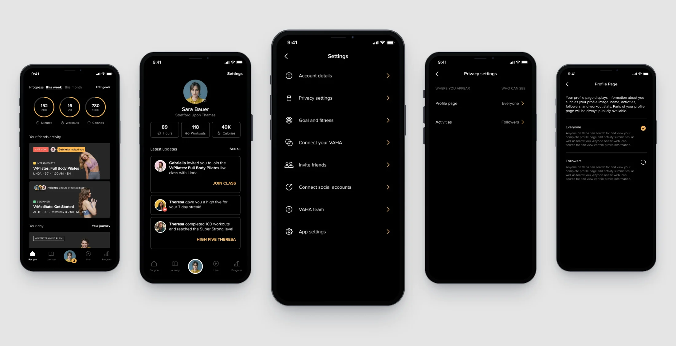
Outcome
Testing two variants of the profile’s entry point and UI with real users allowed the team to make informed decisions on product direction. The variant with the profile as a tab of its own, and the member’s latest updates on it, became the direction for the profile.
Context
VAHA made a smart mirror for training at home, with a companion app. In the designs for the app’s community features, friends and followers, a leaderboard, groups and challenges all sat on the member’s profile, and other members could search for a profile and follow it.
The goal was to decide whether the profile should become a tab of its own and hold the member’s notifications, and how the privacy settings should show who can see a member’s profile and activity.
Placing community features across the app and the mirror
Each community feature needed a place in the member’s journeys. Both prototype files hold a frame from the community and gamification work, titled Journeys, that lists what a member sees at eight destinations across the app and the mirror. For the profile, it names stats and progress, friends with a leaderboard, groups and challenges, and referrals. The message centre gets four notifications: a friend joining a live class, a new reward, a challenge and a new follower. On the map, the profile and the message centre are separate destinations. Whether the profile should hold the notifications was one of the questions for the test.
Journeys, in both prototype files. In this part of the frame, every line is struck through except referrals, on Home and on the profile.
Open in Figma ↗ Get password →01Prototypes
Prototyping a profile tab against a version close to the current app
Making the profile a tab meant a fifth item in the tab bar, which held four in Test A. To find out whether the profile should have that tab, I built two prototypes in Figma as iOS screens, from the same component pages, with the same mock member and content. Test A stayed close to the navigation the app already had. The member’s photo in the Home header opened the profile, and a message button beside it, with the unread count, opened the notifications.
In Test B, I made the profile a tab. The member’s photo sat in the centre of the tab bar, with the unread count on it. Home had no greeting header, where Test A had the photo and the message button. The privacy settings opened on a table of who can see each item, and Add goal became a filled button where Test A had a text link.
Test A, Home. The tab bar has four tabs, For you, Journey, Live and Progress, and none for the profile.
Open in Figma ↗Play test A ↗ Get password →Test B, Home. The weekly progress rings and friends’ activity are the same as in Test A, and only the header and the tab bar changed.
Open in Figma ↗Play test B ↗ Get password →Informing the profile direction with an A/B test
There was no agreed direction for the profile yet. I run user research to inform a direction or to validate a solution.
InformWhere the team disagrees or is undecided on direction, research gives it findings to decide on.
ValidateOnce direction is agreed, research checks that the solution holds up with users.
I built the two prototypes for an A/B test to inform the direction for the profile, and we tested them with users and a researcher. The test compared only the screens that changed between the two prototypes. The settings, the notifications and every privacy screen after the first were identical in both.
Choosing the profile tab
Users did much better with Test B than with Test A, the version closer to what the app already had.
02Test B
Bringing the updates onto the profile
In Test A, the profile was a pushed screen titled You, with a back arrow, and a member’s updates were on a separate notifications screen. In Test B, the profile opened from its tab with no back arrow. I put the three latest updates under the stats, with See all opening the full list. Below the updates, the friends leaderboard, achievements, groups and challenges were the same on both profiles.
Test A, profile. The tab bar is not on this screen, and the leaderboard starts in the first view.
Open in Figma ↗ Get password →Test B, profile. The photo tab shows its selected state, and the leaderboard sits below the fold, under the updates.
Open in Figma ↗ Get password →Showing members who can see their profile and activity
Test A’s first privacy settings screen listed four items, the profile page, activities, live status and workout together, each marked sharing enabled or disabled. No row said who could see the item. In Test B, I made the same screen a table of where the member appears and who can see it, with the profile page set to Everyone and activities to Followers.
Test A, privacy settings. Live status and workout together appear here and in neither version of the table.
Open in Figma ↗ Get password →Test B, privacy settings. The table starts with two rows, against the four items in Test A.
Open in Figma ↗ Get password →After that first screen, the profile page picker offered Everyone or Followers in both prototypes, and saving a change led to the same privacy table, with leaderboards, groups and challenges added as places a member appears.
Both prototypes, profile page picker. The explanation above the choices says parts of the profile are always public.
Open in Figma ↗ Get password →Both prototypes, after a change. The profile page now reads Followers, and every new row reads Everyone.
Open in Figma ↗ Get password →The test compared the profile’s place in the navigation and the format of its privacy settings, on four of the prototypes’ nine screens. It did not include the mirror’s own destinations on the Journeys map. The profile as other members would see it was also outside the test.
Sources
- Test A and Test BFigmaTest A ↗Test B ↗
- PrototypesPlay test A ↗Play test B ↗
- Components ↗Figma, the UI library
Contact
Get in touch
Product design lead across research, design systems and handover, with coding agents in the loop. Contract, outside IR35, or a permanent lead role.
- Available
- Now
- Location
- London, remote or hybrid, UK and EU
- Right to work
- UK settled status, EU citizen
- RolesLead Product Designer, Principal Product Designer, Design Engineer
- Experience10+ years
- ScopeResearch, design systems, prototyping, handover, QA with agents
- LanguagesEnglish, Italian, Spanish
- Email[email protected]
- LinkedInlinkedin.com/in/dariocodipietro
Professional profile
Copy into your coding agentSkills
- Product design, end to end
- UX and interaction design
- Visual design and motion
- Prototyping in Figma and code
- Design systems at scale
- User research and testing
- A/B testing and analytics
- Strategy and discovery
- AI product design
- Design to code, with agents
- Accessibility, WCAG 2.2 AA
- Leadership and mentoring
Platforms
iOS, Android, responsive web, smart TV and connected devices
Sectors
- AI products
- B2B SaaS
- Consumer apps
- Streaming, media and sport
- Health, wellness and food
- Legal tech
- Telecoms and utilities
Tools
- Figma
- FigJam
- Figma Make
- Claude Design
- Framer
- Axure RP
- Storybook
- Claude Code
- Cursor
- Codex
- MCP
- GitHub
- Linear
- Jira
- Confluence
- Notion
- Miro
- Prolific
- Lyssna
- Maze
- PostHog
- Amplitude