VAHA: Community and gamification
As Lead Product Designer at VAHA, I designed community and gamification features for the smart mirror and its companion app, aimed at engagement and retention across live and on-demand classes.
Outcome
The features were successful with users. In the workshop I ran, we set the retention strategy for community and gamification and prioritised the backlog that several of the designs below came from. Their components became part of the design system I built for VAHA, and both prototypes in the profile access test were built from them. As life returned to normal after lockdown, people went back to gyms and in-person training, which made the business too costly to run at a profit.
Context
VAHA let people train at home during lockdown, much like Peloton. Its smart mirror was a connected device that streamed live, encore and on-demand classes, offered training plans and one-to-one sessions with trainers, and showed live health metrics from users’ wearables, with a companion app on iOS and Android.
When I joined in June 2021, the social layer was a new reactions feature and little more, with live reactions about to launch. The aim was retention. A note on the workshop board, linked to the flow zone on Csikszentmihalyi’s diagram, says gamification would help users reach that state and come back.
01Workshop
Giving the team a shared model of gamification
To turn that aim into a backlog, the team first needed a common understanding of what makes a gamified experience work. In June 2021, my first month at VAHA, I ran a gamification strategy workshop on engagement and retention, from a Miro board I set up for it. Before VAHA I had worked on gamification twice.
The board opens with a primer in four frames: Csikszentmihalyi’s flow model, the basics of a gamified experience, the main tools and Bartle’s player types. The basics split a gamified experience into motivation, mastery and triggers. The triggers follow Fogg’s behaviour model: a facilitator for users who are motivated but lack the ability, a spark for users who are able but not motivated, and a signal for users who have both. The main tools are reward systems, challenges, storylines and competition. The team then used the primer’s terms in the ideation that followed.
Benchmarking retention mechanics in Strava, Duolingo and Reddit
To find mechanics that already bring users back, I presented references from apps with gamified journeys. In the teardown I grouped screens from Strava, Duolingo and Reddit by mechanic, among them Strava’s clubs, challenges and leaderboards, Duolingo’s streaks, XP, leagues and lightning rounds, and Reddit’s community awards and avatar customisation. Some labels use the primer’s words, such as a spark for a surprise gift box. Notes beside the teardown ask what VAHA’s regular wins would be, given how well Duolingo’s frequent rewards for small wins work, and record that a challenge mechanic very close to Strava’s was already under consideration.
Generating ideas for each player type
Users are motivated in different ways, so the team generated ideas by player type. Ideation ran twice, a warm-up and then the full board. Both rounds used four questions, the first “What will hook them in?” and the last “What will keep them coming back?” The columns are Bartle’s four types, each with a short profile, such as curious and not competitive for explorers. The full board holds 36 ideas, among them challenges that progress with a movement (50 squats, then 100), leaderboards across live and on-demand classes, a “join me” invite, a workout together with a fresh leaderboard, face-offs on camera in live classes and points to spend in a VAHA shop.
Prioritising the backlog by user value and effort
To prioritise the backlog, we dot voted on the same 36 ideas and ranked them in a matrix by user value and technical effort. The vote is laid out on the board in two columns.
Of the 36 ideas, 19 got votes, and we favoured everyday progress and social proof: challenges that progress with a movement, streaks, levels, badges of honour on the profile, leaderboards across live, encore and on-demand classes, the “join me” invite, seeing who is active, success stories, kudos on friends’ activity, and rewards with points to spend in the shop.
Mechanics that reward only the most competitive members, such as face-offs on camera and a community championship, got no votes. Among the 17 without votes were also content unlocked by level, special-occasion badges, notifications that set a timed challenge, chat, sharing to social media and the workout together.
The board holds no UI. I designed several of the voted ideas in two Figma files, Community and Components, and the workout together as well, though it got no votes. Neither file is dated.
02Tiles
Raising class attendance with social tiles
The mirror and the app list classes as tiles, each with the class photography, the level, the title, the length, the start time and the language, and a tag for encore or live. Until then the tiles were static, with little dynamic content. To nudge users into classes and raise attendance at live ones, we added a social layer to the tile, and I drew seven social states for classes coming up, live and on demand: two or more members in the class, one friend or several inviting you, one friend or several already in it, no one in it, and, for classes coming up only, a workout together with the friends you invited.
For on-demand classes we introduced challenges. An invitation from a friend becomes a challenge to take the same class and compare progress, the invited user gets a notification, and the member count and the friends in class drop out. The app’s smaller tile has the same states, and the copy on both is in German and English.
Mirror tiles. On-demand tiles show the recording date in place of the start time, and the workout together tile has a Together tag and the number of friends invited.
Open in Figma ↗ Get password →Mobile tiles. The calendar control, on demand only on the mirror, also appears on classes coming up in the app.
Open in Figma ↗ Get password →Engaging users with friends’ live activity
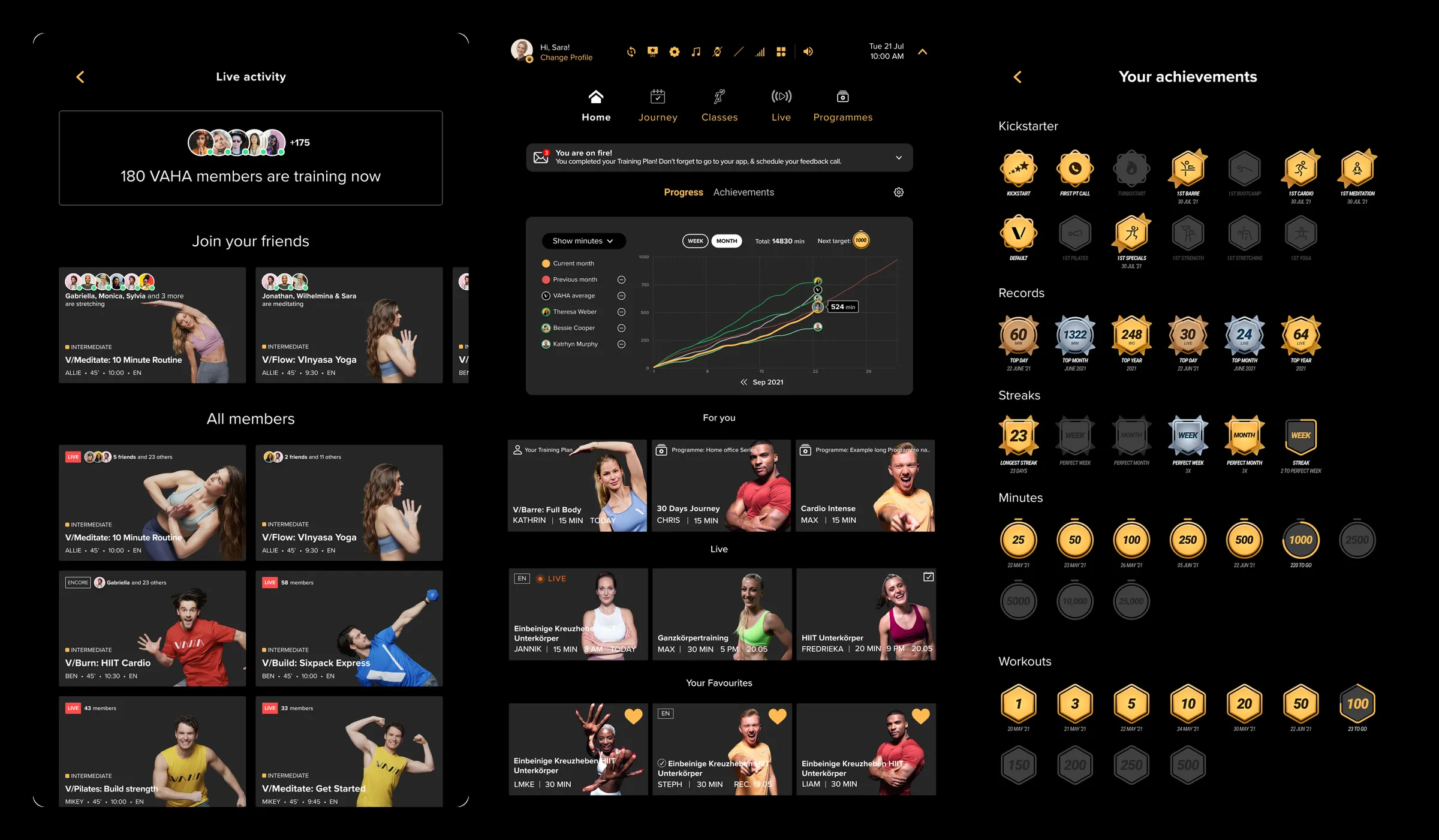
Beyond reactions, users had no view of who else was training. We introduced a live activity screen on the mirror, so there was always a live feed of classes to join. It opens on how many members are training now, then lists the classes friends are in under Join your friends and the classes of all members below. With one friend training, their class is the only one under Join your friends, and with no friends training, or none on VAHA yet, the screen shows all members’ classes only.
Live activity on the mirror. The classes under All members show the same member counts and friends as the class tiles. The prototype starts on the mirror’s home screen.
Open in Figma ↗Play the prototype ↗ Get password →To pull users into the classes their friends are in, we added a second tile type on the mirror that shows which class friends are in right now, with a line such as a friend meditating and a live dot on each avatar. I drew four cases for how the names and avatars fit: one friend, two names and avatars on one line, names wrapping under the avatars, and a large group cut to nine avatars and three names, with a count for the rest. The member count, the friends line and the invitation on the class tiles are one component, the community tag, with four statuses in up to four sizes.
Mirror friends activity. Each row is labelled with its layout rule, on the same meditation class.
Open in Figma ↗ Get password →Community tags. The member count comes in two versions, an icon with a number and a count of members, and every tag is shown from small to extra large.
Open in Figma ↗ Get password →Raising the k-factor with class invites
Users had no way to bring friends into a class, on VAHA or off it. We introduced invites to classes, sent to friends and other members in the app or by email, to raise the app’s k-factor. Each class has an invite button. It opens a list of friends, each with an add toggle, a search that finds other members to follow, and an invite by email for friends who are not on VAHA. Those friends get a free invite to join through the app. An invited member sees the class with who invited them, and how many friends and other members are joining.
Inviting friends to a class. Friends and members are listed with their city, and search results offer Follow in place of the add toggle.
Open in Figma ↗Play the prototype ↗ Get password →Letting users train with friends from home
During lockdown, users missed shared activity with friends and family, and the mirror was by design an individual device. We introduced the workout together so users could train with friends and family from their own living rooms, though it had got no votes in the workshop. It turns a class into an event with friends. The class page gets a Workout Together button, marked new. On finalising the event, the user sets the date, the time and a reminder, adds the event to the calendar and previews the tile friends will see, with how many were invited.
Workout together. The button sits above Start the Class, and the reminder here is set for 15 minutes before.
Open in Figma ↗Play the prototype ↗ Get password →03Components
Keeping users in flow with badges and streaks
To keep users engaged and in flow, we introduced badges and streaks, with reminders of the current streak and of the next step to the next badge. Users could earn badges and keep streaks going through any activity in the app, one-to-one sessions included. Achievements are earned for minutes, workouts, live classes and streaks. A badge in progress is grey, with an orange stroke round its edge for the progress and a line for what is left, such as 120 to go. An earned badge turns gold and shows its date. Records such as a top day or a top month are silver and bronze medals.
Achievements panel. The minutes badge is a stopwatch, the workouts badge a hexagon and the streak badge a shield, and See all opens the full set.
Open in Figma ↗ Get password →Each category has upcoming, in-progress and done states, and records run by day, month and year. Minutes, workouts, streaks, records and live classes each have a five-keyframe unlock animation, and in the streak animation the grey shield turns into a silver medal with a scatter of sparks.
Keeping users engaged after each activity
When users finished an activity, we kept them engaged and gave value back to everyone with a rating all users could see, their progress on badges and streaks, and insights on the session. On the mirror, a class ends with three questions: whether the member liked the session, how challenging it was and how they rate the instructor. Any badges earned come next, then the session’s active minutes, VAHA score, calories and heart rate, with a line on whether the member was in flow, based on the rating. The achievements page groups the badges into kickstarters, records, streaks, minutes and workouts.
Achievements on the mirror. The rating uses hearts for the session, flames for how challenging it was and stars for the instructor.
Open in Figma ↗ Get password →Showing progress and standing against friends
To show users their progress over time, and their standing against their peers, we introduced a friends comparison, a chart of cumulative minutes across the month with the member’s line against the previous month, the VAHA average and anyone they add. It has week and month views, the month’s total and the next target. People are added from a panel that ranks members by total minutes, with a search by name and filters for location, gender, age group, fitness level and goals. On the mirror the panel opens over the home screen, its search uses an on-screen keyboard that can be moved, and each person added gets a line on the home screen’s progress chart.
Adding a friend on the mirror. On the home screen the chart sits under a Progress tab, beside Achievements, above the rows of classes.
Open in Figma ↗Play the prototype ↗ Get password →Sharing workouts as stories
Users had no way to share their training with friends, apart from reactions. We introduced stories, with a rail of friends’ stories in unread, read, publishing and published states, a viewer with reactions and view counts, and a camera with icons for text, colour, drawing, stickers and music. The capture flow has a second entry from a class, and that version adds a “Just worked out” card for the class to the photo.
A friend’s story. Five reactions under the photo, a clap and a drop of sweat among them, with the likes and views down the side.
Open in Figma ↗ Get password →A story from a class. The photo shows the mirror mid-class, with the class card attached and a class tag at the top.
Open in Figma ↗ Get password →Creating a design system
Without a comprehensive design system in Figma, VAHA’s design was inconsistent and the handover to engineering complex. I used this project to formalise the design language into a componentised design system for both platforms, the mirror and the app, to cut the time to delivery and the complexity of handover. The designs in this study draw on one Components file, a UI library built with variant properties for status, type, size and timeframe. It has 13 card types, among them a mirror tile, a mobile tile, a friends activity tile and a story card. The metatags for live, encore, language and level, the live-status dots, the add toggle and the avatars, single and stacked, come in up to four sizes. The file also has filters for classes by level, duration, instructor, equipment and body part, a VAHAButtons set and an on-screen keyboard for the mirror in three versions: current, updated and quick wins.
I was on a contract until January 2022, when I handed the designs over, and in that time I delivered as much as I could with an approach close to waterfall. I would have preferred releasing small improvements first and testing them with live users before moving to larger updates. In retrospect I was too accommodating with the product team, and should have pushed for a leaner approach.
Sources
- Gamification workshop boardMiro, June 2021
- Community ↗Figma: tiles, mirror screens and app flows
- Components ↗Figma, the UI library
- PrototypesLive activity ↗Inviting friends ↗Workout together ↗Add to chart ↗
Contact
Get in touch
Product design lead across research, design systems and handover, with coding agents in the loop. Contract, outside IR35, or a permanent lead role.
- Available
- Now
- Location
- London, remote or hybrid, UK and EU
- Right to work
- UK settled status, EU citizen
- RolesLead Product Designer, Principal Product Designer, Design Engineer
- Experience10+ years
- ScopeResearch, design systems, prototyping, handover, QA with agents
- LanguagesEnglish, Italian, Spanish
- Email[email protected]
- LinkedInlinkedin.com/in/dariocodipietro
Professional profile
Copy into your coding agentSkills
- Product design, end to end
- UX and interaction design
- Visual design and motion
- Prototyping in Figma and code
- Design systems at scale
- User research and testing
- A/B testing and analytics
- Strategy and discovery
- AI product design
- Design to code, with agents
- Accessibility, WCAG 2.2 AA
- Leadership and mentoring
Platforms
iOS, Android, responsive web, smart TV and connected devices
Sectors
- AI products
- B2B SaaS
- Consumer apps
- Streaming, media and sport
- Health, wellness and food
- Legal tech
- Telecoms and utilities
Tools
- Figma
- FigJam
- Figma Make
- Claude Design
- Framer
- Axure RP
- Storybook
- Claude Code
- Cursor
- Codex
- MCP
- GitHub
- Linear
- Jira
- Confluence
- Notion
- Miro
- Prolific
- Lyssna
- Maze
- PostHog
- Amplitude