BritBox: UK acquisition and account
As Senior UX and UI Designer at Massive Interactive, I designed the web and iOS acquisition and self-serve journeys for the first UK iteration of BritBox, an Alpha that kept its catalogue behind a subscription.
Outcome
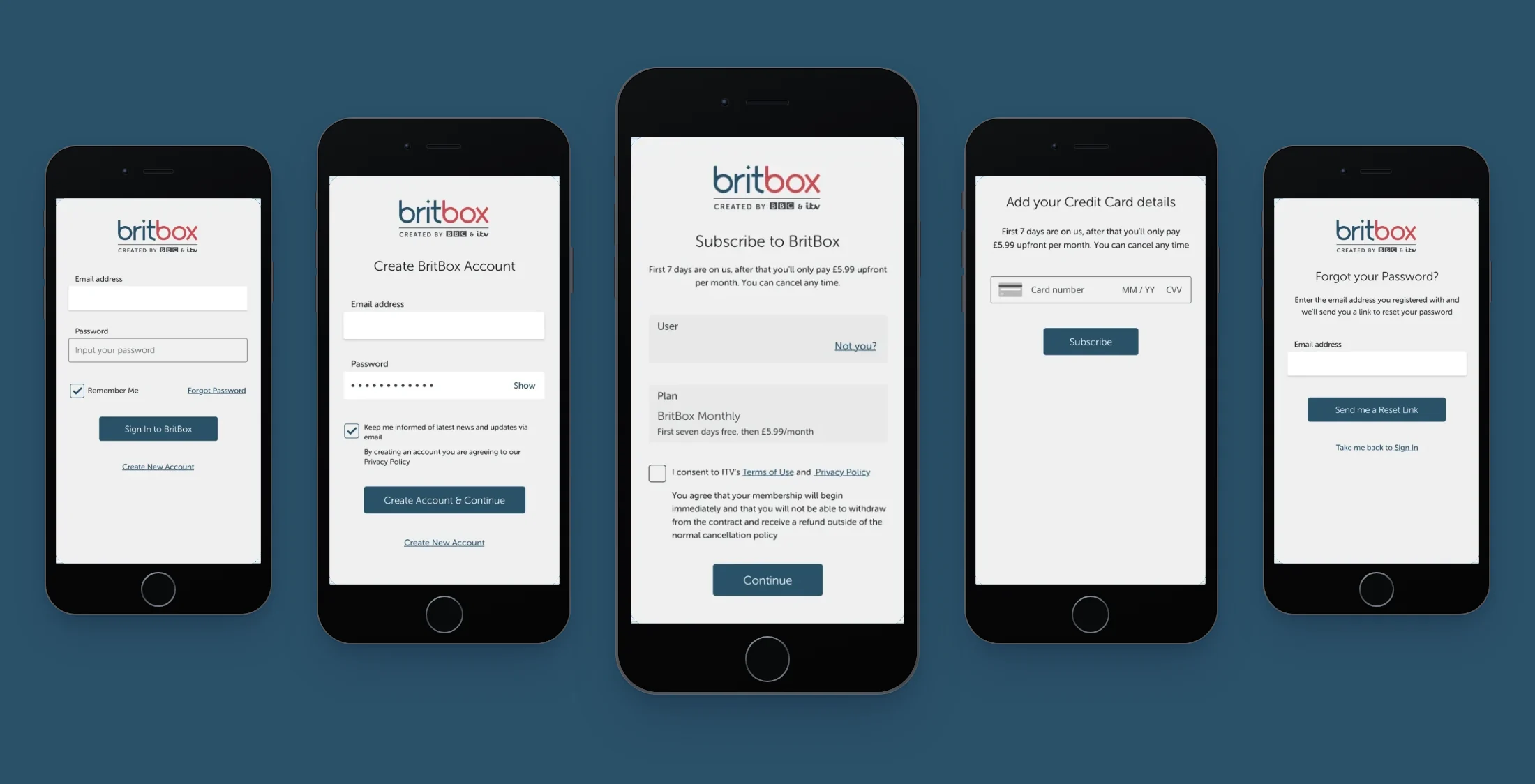
The BritBox UI was fully built around the UX documentation I delivered for this project. The UI team’s final screens of 1 February 2019 carry screen names from my spec, Clear Reset Form, Subscription Intro and Add Payment among them, and the subscription intro keeps every element I numbered in it. I handed the journeys over at the end of the second sprint, with first and last name at sign-up, parental lock and profiles left for Beta.
Context
BritBox, a subscription service for British television and film, had launched in the US, and ITV and the BBC decided to bring it to the UK. They wanted a new experience on AXIS, built from its out-of-the-box modules with minimal customisation. AXIS, Massive’s own VOD platform, could give a broadcaster a full VOD service within a short timescale.
The UK Alpha took a walled-garden approach, with only a title’s synopsis and trailer to see before subscribing, so every viewer came into the service through sign-up, subscribe or sign-in. The work ran over two sprints, from 16 January to 1 February 2019, and ITV and Massive’s product team reviewed it every week. I came to it from the WWE Network and Univision specifications, also written for AXIS.
Deciding what each user level could reach in the walled garden
A visitor could arrive on the home page, through a direct link to a title or by opening the app, with or without an account, and each arrival led to sign-up, subscribe or sign-in. In the project’s Alpha IA, the pages of the service were mapped to AXIS templates and the areas that needed tailoring were tagged, sign-up among them for the Alpha’s walled garden. Sign-in was expected to stay mostly out of the box.
I set out three user levels in the acquisition summary, and what each of them met on each platform. L1 users were not signed in, L2 users had an account without a subscription, and only L3 subscribers could browse or watch.
On the web, an L1 user arriving on the home page met a landing page where the only actions were sign-up and sign-in. A direct link to a title opened a detail landing like Netflix’s, with the title the viewer had come for, its synopsis and a trailer where there was one. Going any further meant signing up or signing in. L2 users met the same pages asking them to finish sign-up. In the app, L1 users always started at sign-in and L2 users at the subscribe step.
The Alpha IA. Genre, talent and collection pages were curated content, built by hand in the AXIS Presentation Manager. Boxes with a bold outline link to the reference app.
Open in Axure ↗ Get password →01Acquisition
Making the acquisition spec easy to reference and review
ITV and Massive’s product team used the acquisition spec in the weekly reviews, and the UI team designed the final screens from it. I documented acquisition in Axure, in three layers, and gave every page a three- or four-letter code, such as SIFL 01 for the clear sign-in page, to make each page easy to refer to. Diagrams gave an overview of the journeys and modules of sign-up and sign-in. Each module held the detail of its screens, error states and exceptions included, with its entry and exit points marked IN and OUT to match the diagrams. A user journeys page laid out the happy paths in full for stakeholder reviews, without the detail of the modules.
Bringing five ways to join into two modules
There were five ways to start joining, on the web, in the app and from an email, and each had to end in a subscription. In the sign-up diagram, the three L1 journeys ran through sign-up (SUFL) and then subscribe (SBFL), and the two L2 journeys went straight to subscribe. L1 users joined from the web landing page, the sign-in screen or an email lead, and L2 users finished sign-up from the web landing page or on opening the iOS app. Journeys from a landing page saved the entry point, and after subscribing, an L3 user went back to it, or to the home page when none was saved.
Sign-up and subscribe diagrams (SUD). The legend groups L2 and L3 as authenticated users, and the goal marker sits on L3. The sign-in link inside sign-up leads to the sign-in diagrams.
Open in Axure ↗ Get password →Sign-up asked only for an email and a password of at least six characters, with the marketing opt-in and the privacy waiver below them. The module covered the form’s states, from an inline tip when it was sent incomplete to the inline errors for a failed request and for an email already registered. The error for a registered email pointed the user to sign in instead. On iOS, the create-account button stayed disabled until both fields were filled in, and a format error came as a system alert.
Sign-up module (SUFL). Eight states, each with its elements numbered. Users joining from an email lead enter at SUFL 03, with their address filled in.
Open in Axure ↗ Get password →Offering the free trial once, with a rejoin path
The subscription started with a seven-day free trial for new customers, and customers who had already used it still needed a way back in. The subscribe module first checked whether the customer had already had the trial. New customers were offered it, and customers who had used it went straight to the monthly price. In the Alpha, the trial was capped by email address.
Both intros carried a recap of the plan and a reminder of the signed-in user, with a “Not you?” link to sign out. The consent box for ITV’s terms and privacy policy was unticked by default, with the waiver on withdrawal and refunds below it. Web users then added a card, and iOS users paid through the App Store purchase sheet. Both paths ended on a welcome screen.
Subscribe module (SBFL). New customers on top and rejoining customers below. The purchase sheet follows the App Store’s own layout, with the renewal policy and Touch ID to confirm.
Open in Axure ↗ Get password →02Self-serve
Taking users from sign-in back to what they came for
Users with an account had to get back into a closed service and reach their saved entry point, or the subscribe step if they had not finished joining. Sign-in on the web had Remember me ticked by default, and unticking it limited the session to three hours. On iOS there was no Remember me, the sign-in button stayed disabled until both fields were filled in, and format errors came in a system alert, as in sign-up.
After sign-in, L3 users went to their saved entry point or the home page, and L2 users went into the subscribe module to finish joining. Sign-out cleared the session and sent web users to the unentitled landing page and app users back to sign-in.
Sign-in, iOS variants (SIFLN). Only the screens that differ from the web, with a link to the full flows. The red note under Join BritBox marks sign-up from the iOS sign-in screen as a customisation of AXIS.
Open in Axure ↗ Get password →Keeping password reset working across app, mail and browser
To reset a password, users had to switch to their mail client to finish. Password reset crossed three environments, with the reset form in the browser or the app, the reset email in the mail client and the new-password form in the browser. On a phone, the new-password form might open in a web view inside the mail app. In the reset flows I set out the states of each step in its own environment, so users could complete the reset whichever way the link opened.
Reset flows (RPFL). The browser or app on top, the mail client and the browser below, and the error for a failed update at the foot. A note beside the sent state says a notification on a phone could open the email directly.
Open in Axure ↗ Get password →Collecting email leads for news of the service
The lead generation page, whose copy said BritBox was coming soon, collected email addresses for news of the service. An email lead was one of the five ways to start joining, and the sign-up form opened with the address filled in. The page sat outside AXIS, and a note in the spec said the UI design would override its UX documentation. A third-party cookie consent came first. Sending then needed a valid email and consent to marketing, each with its own error tip.
Lead generation flows (LGPF). The main row runs from the cookie consent to the sent state, with the two error tips below it. Its responsive guidelines put the form under the promo copy below 720 pixels and beside it from 720 up.
Open in Axure ↗ Get password →Holding the Alpha to out-of-the-box modules
The brief was for the journeys to use out-of-the-box AXIS modules, with as little customisation as possible. The account page used the AXIS templates as they stood, with a greeting, the watchlist, My List and recommended shows, and recommendations alone as the empty state.
I specified the journeys on modules AXIS already had and marked on the page where one needed customisation. Joining from the iOS sign-in screen was flagged as a customisation, and the lead generation page was built outside AXIS.
Sign-up took an email and a password, and first and last name were kept for Beta. Parental lock and profiles in the account were to be settled at a Beta requirements workshop.
03Handover
Handing over a spec the final UI was built from
The UI team designed the final screens and their guidelines. The form and lead generation guidelines in the UX spec followed the documented AXIS breakpoints, and a note in both said the UI team’s final guidelines would override them. The UI team’s exports of 1 February carry the module screens’ names, Clear Reset Form and Subscription Intro among them. The subscription intro keeps every numbered element of its module, and in the style guide the user reminder and the plan recap have a component of their own, the subscription boxes.
Module, SBFL 01-01. The subscription intro for a new customer. The dashed line from “Not you?” leads to the sign-out flow.
Open in Axure ↗ Get password →UI team, 1 February 2019. The same screen on mobile web, under the Created by BBC and ITV lockup.
The UI team’s final screens for the journeys above, 1 February 2019. Sign-in, the reset form, account creation and card payment on mobile web.
The same journeys on desktop, at 1440 pixels. Account creation and the subscription intro in a panel over programme imagery.
What waited for Beta, and what was handed over
Left for Beta
- First and last name at sign-up
- Parental lock in the account
- Profiles in the account
Handed over
- Three user levels, with landing rules by platform
- Sign-up with an email and a password
- Subscribe with the free trial and a rejoin path
- Card payment on the web, in-app purchase on iOS
- Sign-in, reset and sign-out, with iOS variants
- The lead generation page and the account page
Names at sign-up were outside the Alpha’s scope, and parental lock and profiles were expected to need some customisation of AXIS.
BritBox was my last project at Massive. In February 2019 I moved to Discovery. There I documented authentication, subscription and self-service across every platform.
Sources
- The Alpha IA and journeys ↗Axure, January 2019Get password →
- The UI team's final screensSketch exports, 1 February 2019
- BritBox brand presentationKeynote, January 2019
Contact
Get in touch
Product design lead across research, design systems and handover, with coding agents in the loop. Contract, outside IR35, or a permanent lead role.
- Available
- Now
- Location
- London, remote or hybrid, UK and EU
- Right to work
- UK settled status, EU citizen
- RolesLead Product Designer, Principal Product Designer, Design Engineer
- Experience10+ years
- ScopeResearch, design systems, prototyping, handover, QA with agents
- LanguagesEnglish, Italian, Spanish
- Email[email protected]
- LinkedInlinkedin.com/in/dariocodipietro
Professional profile
Copy into your coding agentSkills
- Product design, end to end
- UX and interaction design
- Visual design and motion
- Prototyping in Figma and code
- Design systems at scale
- User research and testing
- A/B testing and analytics
- Strategy and discovery
- AI product design
- Design to code, with agents
- Accessibility, WCAG 2.2 AA
- Leadership and mentoring
Platforms
iOS, Android, responsive web, smart TV and connected devices
Sectors
- AI products
- B2B SaaS
- Consumer apps
- Streaming, media and sport
- Health, wellness and food
- Legal tech
- Telecoms and utilities
Tools
- Figma
- FigJam
- Figma Make
- Claude Design
- Framer
- Axure RP
- Storybook
- Claude Code
- Cursor
- Codex
- MCP
- GitHub
- Linear
- Jira
- Confluence
- Notion
- Miro
- Prolific
- Lyssna
- Maze
- PostHog
- Amplitude