DAZN: Downloads
As Senior Product Designer at DAZN, I designed downloads for the iOS and Android apps, a post-launch feature to keep users engaged with catch-up sport when they were offline.
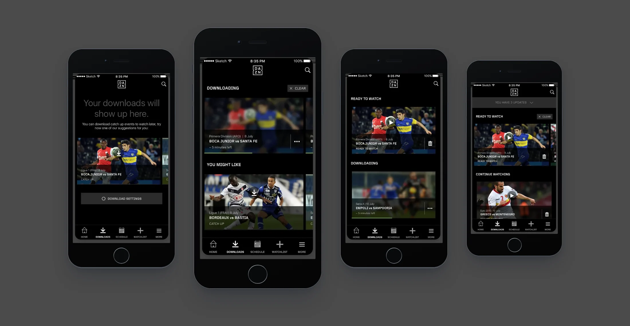
Outcome
The native tiles I redesigned for downloads replaced the old ones across the service and became the standard on every platform, as told in Navigation v2. The downloads feature was very successful with users. It went live and is still in the app today, and it lets users download full games as well as highlights.
Context
DAZN was built to stream live and catch-up sport, so without downloads users could watch only while they were connected. In mid 2016 its product design team split its work between the launch in the DACH markets and the features planned to follow it, among them the sports schedule, a new navigation, event tiles, alerts and downloads.
In the July 2016 leadership review, the brief for downloads was a one-tap download of any available video from the player, and later from browse, with automatic downloads of the teams and sports a user follows. The navigation brief in the same review, a native pattern with room for downloads, following and a schedule, is the subject of Navigation v2.
Giving users one place to manage and watch their downloads
Users needed a place to come back to for what they had downloaded, and an explanation of the feature the first time they used it. I worked through a series of quick prototypes, testing versions in internal team workshops and guerrilla sessions, until I settled on a simple section where users manage and watch their downloads, and which explains the feature on their first visit.
Downloads had a tab of its own in the native apps, where users could start downloading on their first visit. An empty tab shows a line on downloading catch-up events to watch later, suggestions with a download action on each, and the download settings.
Once there are downloads, they are grouped by state, with what users can watch now first, in the order Ready to watch, Continue watching, Downloading and Watched. The suggestions and settings come after them. The version for the leadership review used the tiles then in the app, in a two-column grid, with only Downloaded and Downloading.
Leadership review, July 2016. Gesture icons between the screens mark a pull for more suggestions, a tap to download, time passing and a tap to remove. Removing an event brings up a confirmation that states the space it frees on the device.
01Round one
Showing users what they can do with each download
At each stage of a download, users needed to see what they could do with it, on whichever phone or tablet they used. I drew seven states of the tab on both platforms across eight breakpoints, four on iOS and four on Android, 46 renders in all. The states are the empty tab, more suggestions loading and loaded, a download in progress, one ready while another downloads, the full list, and the actions on a download. The set shows how the tab adapts from the smallest iPhone, at 320 points, to a tablet.
Each downloaded tile names what the user can do with it: Ready to watch, Resume watching or Watch again. A download in progress shows a blurred image, the time left and a progress bar, and its menu opens Pause download and Cancel download over the tile. The bin on a tile and the Clear button on a section remove downloads.
On phones each section is a carousel, and pulling past the last suggestion loads more. The iPad and the 600 dp Android tablet show the suggestions as a two-column grid with Load more. Android has its tabs at the top, under a Watch app bar.
Downloading, at every breakpoint. iOS at 320, 375, 414 and 768 points above Android at 360, 384, 480 and 600 dp, all at one scale. The 480 dp set is drawn on a Kindle Fire, with its navigation bar.
iPhone, the full list. Three updates sit in a collapsed banner at the top. A watched download stays under Watched, to watch again, until the user clears it.
Android, the full list. The same sections under scrollable tabs, with the number of updates as a badge on the Downloads tab.
02Round two
Redesigning the tiles for downloads and the whole service
Downloads used the same tiles as the home page, and users kept raising problems with the first release’s tiles, so from July 2016 I redesigned them while working on the feature. The new tiles replaced the old ones across the service.
In the January 2017 Navigation v2 design, Downloads kept its tab, last in the tab bar after Search. The tile of a download in progress now has a cancel button and a pause button inside a ring that shows its progress. A finished download moves up into Ready to play, above the ones still running. A removed download can be brought back with Undo.
Navigation v2, January 2017. From the Home tab to an empty Downloads tab, two suggested downloads started, and the first one ready to play. Suggested downloads stay under the user’s own at every step.
Letting users set up downloads in advance
Users could not download an event while it was still live, so we let users set downloads up ahead of time. On an event still live, the tile’s options offer add, play and a scheduled download, a download icon with a clock. In Settings, each team, player or competition a user follows lists Alerts and Downloads, the automatic downloads in the brief.
Tile options, Navigation v2. The options open over the tile’s own image, blurred behind them. The download with a clock is a glyph of its own in the v2 icon font.
Letting users choose highlights or the full game
The player came first in the brief. A full game takes far more space than its highlights, so users needed to know the size of each before choosing what to download. A colleague mapped the player flow in July 2016 by what the user is watching and what can be downloaded now or later. In the 2017 player states for iOS and Android, a sheet offers highlights or the full game with the size of each, 23 MB against 500 MB in the mock-up. While highlights are not ready, it offers only the full game. An event not yet available can be queued with its expected time, and a download on a full device ends in a message to free up space.
Player download states, Android. Phones on the top row and a 600 dp tablet below, where the choice opens as a popup over the player. The player itself shows Downloading highlights or Download queued once the choice is made.
03Round three
Helping users manage space on their device
Users needed to see how much space their downloads used on the device and to free it in a few steps. In Navigation v2.1 I redrew the tab for iPhone on a Sketch page set up for an InVision prototype. Search sits in the tab bar, and cast and edit in the header.
To make the state of every download readable at a glance, I moved downloads from rows of tiles to a single list, where each row shows the minutes and megabytes left, or that the download is paused or expiring.
Edit mode opens with the space all downloads take up on the device, and selecting downloads shows how much space they use before the delete. A swipe on a row reveals delete for a single download.
Navigation v2.1, iPhone. The empty tab with popular events, a download started, the full list, a swipe to delete, edit, and a selection of two. The thumbnails are placeholders in the Sketch file.
To give the native teams the new controls as assets on each platform, I included in my handover the v2 icon font, exported for iOS and each Android density, with glyphs for download, scheduled download, pause, bin, edit and undo.
The first versions were drawn before DAZN launched. At that point there was no data yet on how its users would download. After Navigation v2 rolled out I moved to the NFL Game Pass International white label.
Sources
- Leadership review deckJuly 2016
- Download states at eight breakpointsSketch, 2016
- Navigation v2 and v2.1 filesSketch, 2017
- iOS presentation to AppleJanuary 2017
- Portfolio slides2019
Contact
Get in touch
Product design lead across research, design systems and handover, with coding agents in the loop. Contract, outside IR35, or a permanent lead role.
- Available
- Now
- Location
- London, remote or hybrid, UK and EU
- Right to work
- UK settled status, EU citizen
- RolesLead Product Designer, Principal Product Designer, Design Engineer
- Experience10+ years
- ScopeResearch, design systems, prototyping, handover, QA with agents
- LanguagesEnglish, Italian, Spanish
- Email[email protected]
- LinkedInlinkedin.com/in/dariocodipietro
Professional profile
Copy into your coding agentSkills
- Product design, end to end
- UX and interaction design
- Visual design and motion
- Prototyping in Figma and code
- Design systems at scale
- User research and testing
- A/B testing and analytics
- Strategy and discovery
- AI product design
- Design to code, with agents
- Accessibility, WCAG 2.2 AA
- Leadership and mentoring
Platforms
iOS, Android, responsive web, smart TV and connected devices
Sectors
- AI products
- B2B SaaS
- Consumer apps
- Streaming, media and sport
- Health, wellness and food
- Legal tech
- Telecoms and utilities
Tools
- Figma
- FigJam
- Figma Make
- Claude Design
- Framer
- Axure RP
- Storybook
- Claude Code
- Cursor
- Codex
- MCP
- GitHub
- Linear
- Jira
- Confluence
- Notion
- Miro
- Prolific
- Lyssna
- Maze
- PostHog
- Amplitude